
Sliders — or, as one web designer calls them, “interactable ghost towns” — are everywhere, especially on WordPress sites where they are one plugin click away. They look pretty and seem to save space. But the data says they are bad for your website, and you should not be using them.
Nobody sees your slides
Visitors bounce fast, skim text, and decide within the first 10 seconds whether to stay. Hiding content inside a slider is a barrier to entry — and people simply do not click through:
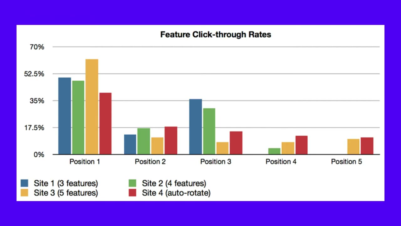
- Erik Runyon’s study at the University of Notre Dame tracked carousel clicks across five sites. The first slide took the overwhelming majority — 84% of clicks on one site, 48–62% on the others. The remaining slides split the scraps.
- Conversionista, a Swedish conversion optimization firm, compared a static image against an image carousel using eye tracking and heat maps. The static image was clicked 40% of the time; the carousel just 2%. Users mistook the slider for an ad — classic banner blindness.
- Adobe optimization manager Blair Keen removed the above-the-fold slider from an e-commerce site and sales rose 23%.
They slow your site down
Popular WordPress slider plugins measurably hurt performance. In speed tests, activating Slider Revolution added 1.7 seconds to the speed index, and placing a Smart Slider 3 slider on a page cost up to 20 points on mobile.
The only good slider
Want an effective slider? Turn off autoplay, delete every slide except the first, remove the arrows, remove the bullets. What remains is a static hero image — which is exactly the point. The one legitimate exception: product image galleries, where visitors actually expect to browse photos.
If your design needs a slider to fit your content, the design has failed. Use one strong static image instead.
For the full argument and all seven studies, watch the video this post is based on. Warning: vulgar language — NSFW.
Source: Are Sliders And Carousels Good Or Bad In Web Design? by The Website Architect.